You should be using Figma Auto Layout more
Last updated: 2022-07-23When I first discovered Figma, the Auto Layout feature was a pitiful imitation of the full power of CSS Flexbox. Fortunately, this is no longer true, and Auto Layout has obtained more or less the same amount of power that I get when building layouts in code. However, despite the drastic increase in power, I still find this to be a greatly underutilised feature, so I thought I would write up some quick tips on how I think you should be using Auto Layout better and more frequently.
Tip 1: Group and move everything with auto-layout
The first tip is that you should simply be using Auto Layout a whole lot more. Those Header links? Auto Layout. Typography? Probably Auto Layout. Your whole page from top to bottom? Auto Layout.
Using Auto-Layout has numerous advantages.
First, your elements are much easier to rearrange this way. Just
select your element then press shift + arrow key to move its
position in the Auto Layout container.
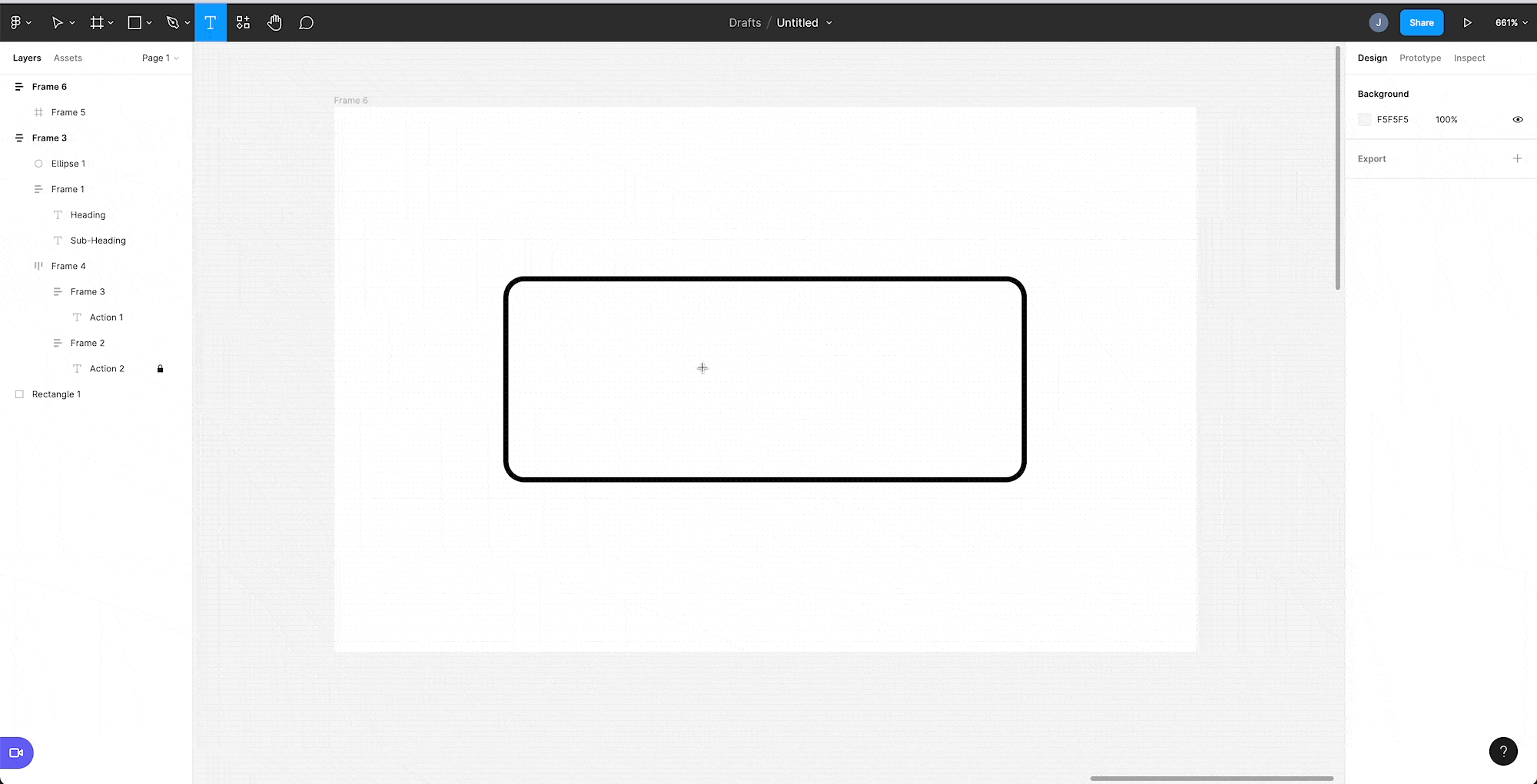
Next, Auto Layout gives you much simpler control over padding. For example, without Auto Layout we could make the button below by manually dragging the inner text into place and then using the constraints system to keep the text the right distance from the edge of the button. This works, but is a faff. With Auto Layout, all we need to do is enable Auto Layout on the parent Frame, set the desired margin, then see everything magically fall into place.

Lastly, your spacing is consistent by default as Auto Layout children must have the same gap between them. This adds a degree of visual polish to your designs.
Event when you wish to have variable spacing between stacked elements, this is also something you should be achieving with Auto Layout.
Consider the example of the layout below. We have a logo, heading, sub-heading and two buttons.

You can break this down into three Auto Layout components like so, with 16px spacing between the icon, text and actions (highlighted) and tighter 4px spacing between the text. We also use a horizontal Auto Layout frame to arrange the buttons.

Tip 2: Rectangles Should Usually Be Auto Layout Frames
One big mistake that I used to make was using rectangles when I should have been using frames with Auto Layout. Although you may be tempted to use the rectangle tool and grouping to create rectangular components, Auto Layout offers more resilient responsive designs (see the first Button example above for a visualisation of creating such a component with Auto Layout).
The exception to this is when you are creating more intricate shapes where the ability to finely edit the rectangle's vector networks (something that is not possible with frames) comes in handy.
Tip 3: Use Shift+A
Honestly, this shortcut saves me so much time. Shift+A enables Auto Layout for the currently selected Frame.