I've Been Writing CSS Wrong Part 1: The Layout Component
2020-07-12 • 476 wordsOver the past month or so, I've thought a lot about CSS. Thanks to some tweets, watching Layout Land, the excellent Every Layout and discussion with other engineers, I've come to the dramatic conclusion that I've been writing CSS wrong.
In summary, the mistakes I have been making can be described as the following: ignoring the fact that good programming principles (composition over inheritance, separation of concerns, DRY, minimise API surface area) still apply to CSS.
Ignoring this point isn't catastrophic. You will still be able to style components as desired. However, only applying good architecture and programming principles to code, and not CSS, will increase complexity, suck time into fighting bugs, and have you writing a lot of boilerplate. In this three-part series, I'll be looking at some approaches to improving the situation:
- Utilise the Layout Component
- Adapt styles with style props, not ad hoc CSS
- Use Intrinsic Styling
While the position these principles have got me to is certainly not perfect, they have made things dramatically better. Instead of reimplementing the same patterns over and over again, I reach for ready-made solutions. Styling has fewer bugs as reusable solutions are thought out in advanced. Designs look great at all screen sizes. Most importantly, however, I have a far clearer view of the overall structure of the DOM and my styling. I feel like an architect, not a builder.
In this post, we'l examine the first approach: the Layout Component.
What is the Layout Component?
Most component libraries will contain some collection of buttons, inputs, forms, and date-pickers. These are what we traditionally call 'components' and they have a satisfying, visible tangibility to them. However, as any good front-end developer knows, there are other kinds of components too—higher-order components, render-prop components, and containers to name but a few. In this post, I shall introduce a new category of component that I've seen appear in various component libraries: theLayout Component. The Layout Component abstracts the responsive spacing and arrangement patterns used in your app. It renders and styles `children`, yet provides no direct functionality or styling if used in isolation. In other words, the Higher-order Component is to logic as the Layout Component is to styling.
A Simple Example: The Stack
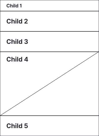
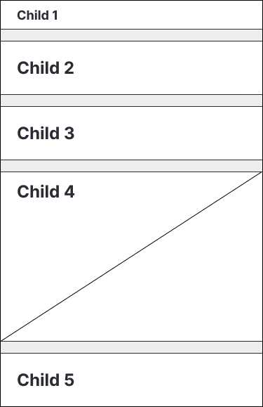
One of the simplest ways to illustrate the Layout Component is with the <Stack />. The <Stack /> has one job: take an array of children and arrange them next to one another.
<Stack>
  <ChildOne />
  <ChildTwo />
  {/* ... */}
  <ChildN />
</Stack>You can also add some spacing, if you so desire.
<Stack spacing='1rem'>
  <ChildOne />
  <ChildTwo />
  {/* ... */}
  <ChildN />
</Stack>
The Stack occurs all over UI. I have used the Stack to lay out form elements, paragraphs of text, and navigation links. Once you consider horizontal stacks, allowing spacing between elements, padding, and different item alignment options, it is amazing how far this one component gets you.
Benefits of the Layout Component
Layout components like the <Stack /> reduce boilerplate and make your team more productive. They provide off-the-shelf solutions to common layout problems, thus ensuring high-quality design and cleaner code through consistency. However, the biggest benefit I find with theLayout Component is that you are forced to write good CSS. When you write CSS for many screens, not one, you take more care. Furthermore, designing a component for many situations makes your CSS more robust as you have to think of edge cases up front.
Writing CSS the Layout Component Way
Although the Layout Component is simple in theory, it does lead to some initially counter-intuitive approaches to developing UI.
Padding Over Margin
First, it will soon be noted that applying margin directly to child components is usually an anti-pattern in the world of the Layout Component. Margin applies spacing from the children in your layout whereas padding applies spacing from the parent (the Layout Component). Since which children are used is specific to the situation but layout components are generic, using margin is an ad hoc solution.
The exception here is when you apply margin from the parent and treat it like padding. The lobotomised owl technique uses this principle, for example.
Intrinsic Over Extrinsic
Second, most components should not be sized intrinsically. Rather, they should either expand according to their content or their container. Defining rigid component sizing is a sure-fire way to make your UI brittle. Defining components which fill their container or expand according to their content is far safer (see part 3 in this series for more on this).
Generic Over Custom
The third paradigm shift in the transition to Layout Component CSS is that you should find yourself writing very little custom CSS. If you do find yourself writing one-off CSS, perhaps it is time to see if you can come up with a more reusable solution.
The ideal of the Layout Component is to have all your UI pre-made, and as easy to construct as Lego. Of course, this is an ideal, not a reality, but it is a good one to strive for.
React is Legos for adults
— Guillermo Rauch (@rauchg) November 29, 2018
Series links
- Part 2: Style Props - Coming soon
- Part 3: Intrinsic Styling - Coming soon

